Abstract Paintings 2016
The paintings on this page were created between January and May of 2016. The paintings are not connected to each other, rather they each have their own unique story. Below the images are short narratives about each painting. To see the process of the paintings' development click on the "Painting Process" link at the bottom of this page.
Trying Not To Drown
Trying Not to Drown
Acrylic 36"x36"
Keep Moving
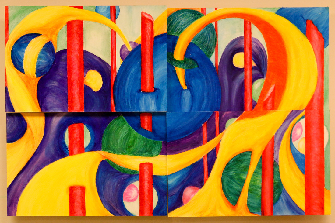
Keep Moving - Water Soluble Oil Pastels - 23 1/2" z 21 1/2" 4 11"x17" watercolor paper Panels mounted a 4 different heights.
Suspended Movement
Suspended Movement
20x24" - Oil
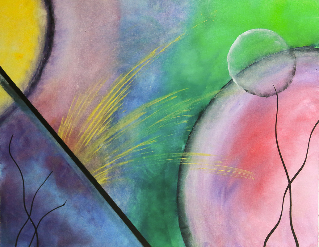
Reaching
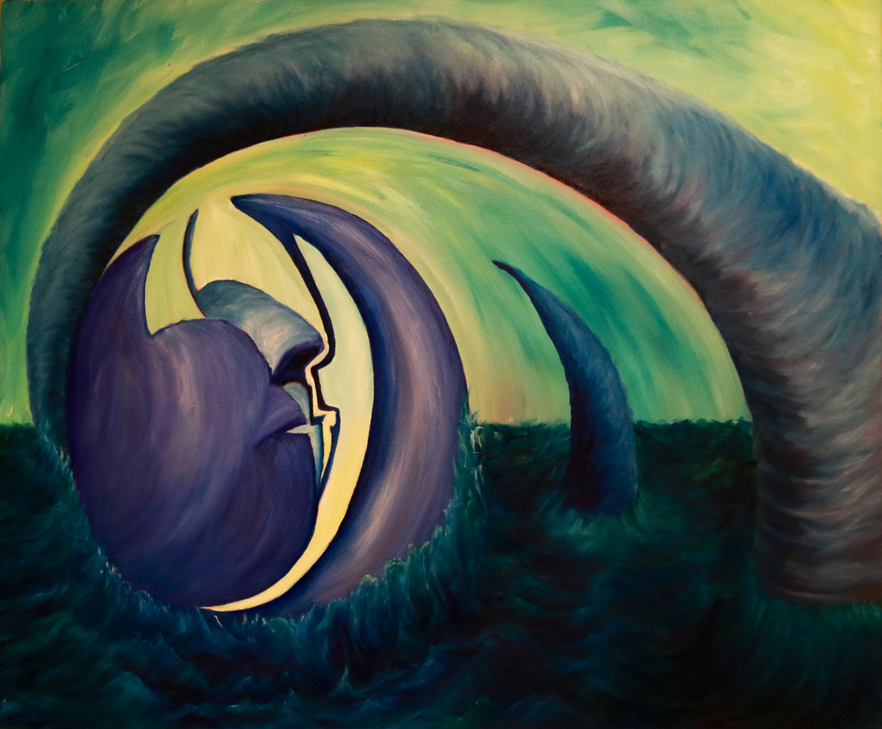
Reaching - 30"x36" - Oil
Reaching has been through quite a shift in both color and meaning throughout its creation. What started out as an angry expression of an attack evolved into an expression of hope for a reconciliation of the fractured orb a midst a turbulent sea. To see the evolution of this painting from the original chalk drawing on canvas to the final oil composition click on the Painting Process Explained button below.
What I had hoped to convey is a sense of emerging calm movement rising up from the turbulent sea. The broken orb has been cracked, but not totally split apart. There is still a small sliver at the bottom that holds it together. The suggestion of 2 faces contained within it symbolise the two souls held within the orb. While the solidity and security of the relationship are threatened the broken points are still reaching toward each other. The large curved cone of calm strength reaches up from the turbulent waters in an attempt to shelter and push back the fractured parts. Beyond the horizon line awaits a calm healing atmosphere. While there is still the possibility of stormy skies approaching on the left, the protective arm shields the orb as the healing light of the background enters the cracks providing the needed energy for the edges to continue reaching back together.
While I used primarily the same colors in this painting as I did in the first of this group "Trying Not To Drown", the application is different and creates more of a sense of calm in contrast to the feeling of angst communicated in the first painting. The difference in feelings portrayed between these two paintings are reflective of differences in many aspects of my life between the time I was creating these 4 paintings. Somehow I feel like the universe intended for this painting to be the one I completed last.
The Group of Paintings as a Whole
The four paintings above are so different from each other that looking at them it’s a wonder they were all created together within a 4 month period of time. However, as I look back on them, because I know what my life has been like in the three months span of their creation, they are all totally representative of a time when my life was constantly shifting directions in so many areas.
I started out wanting to create a series of paintings on the topic of Emergence. What started out as an intention to illustrate a time and process of growth quickly turned into a time of turmoil. The positive outlook I began with was crushed by life events causing great frustration and pain as I struggled not to drown in the midst of a crumbling life. That feeling is represented in the first painting “Trying Not To Drown.”
At times I couldn’t even look at that painting without being sucked into the pain of the time. I tried to project a peace I didn’t feel and the painting wasn’t working. I surrendered to the painting and let it guide me to represent what I was really experiencing, the feeling of drowning. While I was working on Trying Not To Drown I began Reaching. It started as a means to work out the frustrations I was feeling through both the harsh strokes and turbulent color choice. That painting sat for a while as I worked on others avoiding dealing with the feelings that were coming out when I began it.
At some point I needed a break from being emotionally connected to my paintings. I needed to be able to not think about the meaning of what I was painting but to immerse myself in the creative process of developing an appealing composition. With all the chaos around me I just needed a process that would allow me to re center myself so I chose to return to form and movement and the reoccurring circles and arcs that appear in most all my previous paintings. I needed to create structure void of specific symbolism. I needed to brighten my pallet and bring some joy back into the painting process. I wanted to challenge myself to just create complex visual movement throughout a piece using simple forms. Keep Moving is a 4 panel piece that was created with the panels attached to a board but slightly separated by the tape that held them in place. The tape allowed me to create both a boarder and a gap in between shapes. I had planned to mount each panel at a slightly different height from each other to increase the complexity of the finished piece. I worked on this piece when taking breaks from the others. Working with water soluble oil pastels allowed me the flexibility to start and stop anytime. The color would reactivate with water and be mixable but within minutes be dry enough to not smudge in transport. It’s rather versatile. The color can appear dull, especially when mixed with white. However, covering the finished painting with a clear acrylic sealer bring out the color vibrancy.
The painting that was the most fun and liberating to paint was Suspended Movement. This painting started out as simply capturing a moment in time where one liquid was in the process of dispersing into another. (This is a process I do with my students to illustrate color theory and how rain forms.) For this painting I took a series of photographs of food coloring dispersing in water. I then chose the composition that was most appealing and painted it.
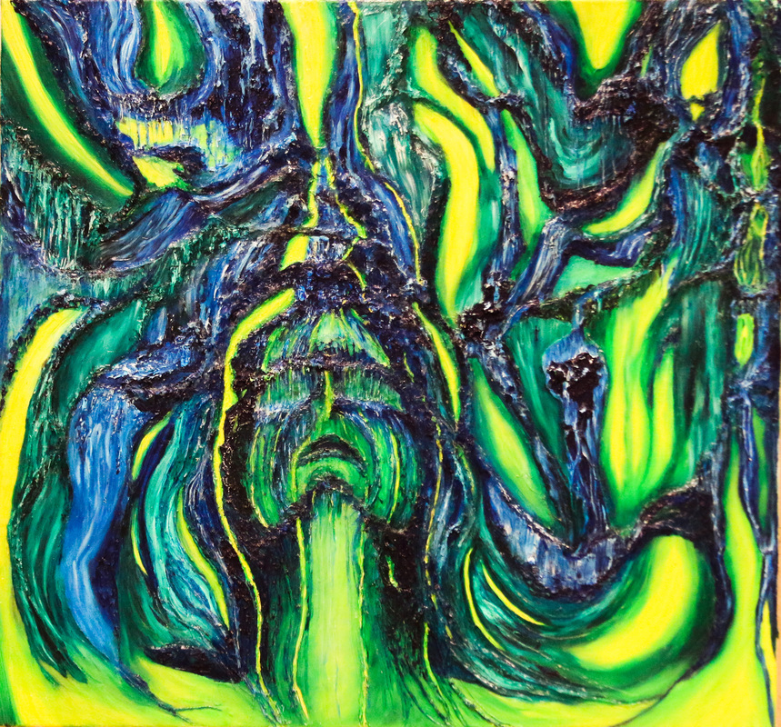
Melting Away the Cage
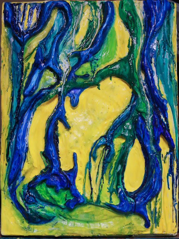
18x24x4 - Mixed Media - Wax and acriclic on carved foam Insalation Board
Melting Away the Cage is a work whose design was first based on a series of photographs I created that documented the dispersion of food coloring into water. I was intrigued by how the color would flow in a seemingly unpredictable manner. Suspended Movement was also created based on that unpredictable dispersion. The difference between these two artworks, other than the obvious dimension and color usage, is that Melting Away the Cage took on a more symbolic meaning rather than just the illustration of a process done with a different media.
I consider this a painting even though it is actually a carved relief. The organic raised areas of green and blue are based on the abstract photographs, but only in shape and form. The colors used in this painting are the same as those used in Trying Not to Drown. The raised areas in that painting were added to the surface using silicone caulk. This painting's raised areas were created by carving out the negative spaces. Those negative spaces became yellow, symbolising spirit. The organic forms once contained all the yellow space, but slowly are melting away, being broken apart by the force of the spirit trying to break free. The heat of energy as it grows in strength melts away the cage.
Considering my own life situation at the point of creation this piece has become the second work in a series of paintings illustrating inner struggles I've experienced. They have helped me put capture a time in my life where all wasn't wonderful but though it all, the spirit continued to grow, refusing to be diminished.
Spark of Freedom - Resolution